Monday, May 30, 2011

SDC31- Acetate


the stampotiqe designers challenge this week is to use Acetate. it's a Stampotique Stamps only challenge but there's a fabulous prize to be won.

I used Sunny stamped on white card and coloured with pencils. I used a "scrapling" of acetate. ie the bit left over when I trimmed an A6 acetate card down to a square.

I swiped blue acrylic paint across it with a sponge to create a background.

Sunday, May 29, 2011

LIM - bottom left


I can't seem to get this challenge out of my brain, usually when I do a challenge, that's it! gone! but this one won't go away. I keep thinking, one more and I'll have it out of my head, but I do one, and I'm on to thinking about the next.
This time I tackled the bottom left corner, using PaperArtsy stamps (talking of PaperArtsy, in the new Craft Stamper mag which is just landing with subscribers, I have part 3 of the one layer wonders article, using just PaperArtsy stamps. And I also have a stamping contrasts as well)
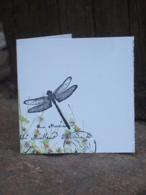
I made another mini card. it's about 2.5 inches. I finished it with Flower soft.

LIM : Part 3..


I've become thoroughly obsessed with finding images I can use in the top right hand corner of cards thanks to the LIM Challenge. (this one has actually gone a bit over the space that's allowed, but I won't tell if your don't)
This time I've gone a bit steampunk.

These stamps are from the new Scrolls work plate, Scrolls work are in the middle of a going out of business sale, so all their stamps are 40% off at the moment. I'm not sure if the stamps are still available individually or if they have already sold out.
This really couldn't be an easier card. Words stamped in black, and then the image stamped with a second impression with grey ink. and that's it. maybe I should add more to it...

Saturday, May 28, 2011

same challenge, different corner..


After seeing Kathyk's lovely card made with the free stamp from Craft Stamper, I was desperate for my issue to arrive as I though that the chandelier would look good hanging in one corner of the card. Luckily it arrived today, as I had challenged kathy for us both to make a card with the chandelier in the corner of the card as a second entry to this week's LIM challenge


I thought I would be a bit of a smartypants and use the top left corner this time. but guess what.... kathy did the same. I love to see how similar/different two people make samples with the same stamps and brief.

thanks for the little game Kathy, it was fun!

I tried to make mine look like peeled wallpaper, by gluing the paper to the card and then ripping it off, and sanding the remaining paper. I also added a bit of flock paper, and some sepia accents to the chandelier

less is more- pick a square


I love this week's challenge at Less is More. You have to pick one of the corners or the centre square of a card and only use that square, leaving the rest as white space.

I decided to pick the square I thought would be most difficult. Top Right. I decided that I needed something to either float or hang there to make it work.

So I made two. A full size (5") card with a hot air balloon from the frantic stampers own range of stamps, and a 2 inch mini card with bow heart from Stampotique (also available from Happy Daze)


I used Jenny Bowlin inks on both (they swipe really nicely) from Happy Daze and basic gray papers (from The Frantic Stamper)

I'm also entering this for Secret Crafter's Saturday Challenge where the theme is Clean and Simple

Friday, May 27, 2011

gorjuss floating front


I've been waiting for this gorjuss girl to come back in stock at Happy daze for a couple of weeks now, as I was desperate to try her out with my floating front card technique (as seen in Craft Stamper Magazine)


I have coloured her with pencils and paper pieced the bird with some paper from my stash.
The bird background is done with a mask from a set of five and Jenni bowlin soap powder ink (both from happy daze) I distressed the top with my brand new paper distresser. I can finally stop using my scissor blade!


but why the paperclip? lol I didn't quite get round to doing the tab fastener at the back.... but I will, although I quite like the paperclip!

Thursday, May 26, 2011

Tutorial : swing card


I have a tutorial posted on the Frantic Stamper Blog today for how to make a swing card.

My technique allows you to make a swing card any size you like, with any (symmetrical) swing shape. This is the kind of swing card where you can see the whole of the swing bit, i.e. it doesn't hide part of it when the card is closed.

there's no template, just a pattern which you can apply to any shape, as long as you can devide its width into four, there's just a few simple rules
  • The swing shape needs to be vertically symmetrical.
  • You need to be able to measure its widest point, and divide this measurement by 4.
    • The key to this is find this measurement, make a note of it, and from this point just consider it a “chunk” or “measure” as all further measurements will just be a multiple of this.
    • In the sample I have made I have used a 4 inch square, as this is the simplest shape to explain it, but you could just as easily use a heart or circle, and any size can be divided by four.
  • The height of the shape and the final card are unimportant.
  • The width of the final open card will be twice the width of the shape.

if you do not understand the card instructions which are here please comment with your questions on this post and I will answer them.

really cute baby knitted waistcoat


Despite the fact that I must have thousands of knitting patterns, when I recently saw this pattern and yarn in a knitting shop recently I knew I had to make it for a friend who will soon be having a baby boy. I made it in the first size, and it is made with just a single 50g ball of this love sirdar snuggly crofter DK yarn.

Don't you just love the fairisle effect, which has been made small specifically for small knits. You can see how different it looks on the front and the back due to the different widths of the pieces.

but it still all works together. I even like the randomness where the front joins the back (and yes I'm very proud of my seams, lol)

Wednesday, May 25, 2011

OLW: Cats and Dogs


This week's challenge at One Layer Wednesday is Cats and Dogs, which gave me the perfect opportunity to use one of these DoCrafts Pampered Pets Clear stamps that I picked up recently as I thought that they would make good "for normal people" cards. I also thought they'd work with the pencil on kraft card technique that I love so much.

I couldn't decide whether to add a sentiment to this card, but decided to leave it, as I can easily add one later.

The "wet nose" and jewels are enhanced with Sepia Accents. The brown hint works well on the kraft card.

thank you Chris for pointing out that this also fits with the Kraft Journal Challenge of Clean and simple

Tuesday, May 24, 2011

Crazy Amigos- insects and my first ever art jounalling


I have been thoroughly inspired by the very talented Kate Crane to try my hand at art journalling. This is something that so "isn't me" but I wondered if I could make it so.

So I've journalled within a card that is very much me. I'm so into using the torn sticky edge of post-it notes at the moment, to create a random edge frame on a one-layer card.

I stamped medium bee from Jo's range at Stampotique, then masked the bee and the background.
I then inked with the Jenny Bowlin Malted milk ink (it's on special offer at the moment) which I was ispired to use after seeing Jo use it at The Happy Stampers Show. What a lovely colour, like a light honey. I applied this with blending foam and also stamped Hexagons (although these don't really show)
I then left the masks in place and drew random lines. I'm not yet ready to jounal my own thoughts so I used those of another

When the first summer bee
Thomas Moore

When the first summer bee
O'er the young rose shall hover,
Then, like that gay rover,
I'll come to thee.
He to flowers, I to lips, full of sweets to the brim--
What a meeting, what a meeting for me and for him!

Then, to every bright tree
In the garden he'll wander;
While I, oh, much fonder,
Will stay with thee.
In search of new sweetness thro' thousands he'll run,
While I find the sweetness of thousands in one.

I wrote the words in my normal handwriting, allowing them to go over the edge, so you only get a snippet.

Finally I removed the masks, stamped Daisy Daisy, coloured the flowers and bee body with markers and added stickles to the wings. as a bee is an insect I am entering this for Crazy amigos' insect theme.


Stamps are available from Stampotique and all products are available from Happy Daze,

Monday, May 23, 2011

it's just about the words.

This is the simplest card made for a neighbour that just had a baby boy. I was going for simple, cute and commercial. The words from the bits and pieces set from Rogue redhead designs were the perfect finishing touch. It's so useful to have such a complete set of coordinating greetings to hand. The font and size of the baby word are perfect for nestling up against the handcut paper heart. And then the Congratulations word inside ties in the front with the inside.


don't forget to visit the rogue redhead blog for lots more inspiration on how to use these stamps

Saturday, May 21, 2011

LIM - butterfly


oooo one of my favorite themes at Less is More this week....Butterflies
butterflies are so easy to use, but I have tried to do something a little bit different. I wanted my butterfly's wings to extend beyond the edge of the card, but I didn't want to just stick it on (first of all have you ever tried cutting out antennae?

so, I started with a square card, stamped the butterfly and then drew a line down each side of the card 1 inch from the edge, up to the the wings, I then cut along the line and around the wings.

to do the embossed dots, I stamped another butterfly and cut it out and then drew around it on the reverse side of the front. so I knew where the edges were, and then used a fiskars embossing board to emboss the dots by hand.

I coloured the butterfly with pencil and blended. I did a grey shadow with pencil and blender to lift the butterfly from the card. I also added a light glittering to the wings with stickles.

up to this point the card is still one layer, but then I felt the need to add some words, so it's not one layer anymore!

Both of the stamps are by Stampotique.

Friday, May 20, 2011

recycling challenge at Stampotique


Welcome back to the Stampotique Designer's Challenge!

This week, Valerie is excited to challenge us to make use of items that might otherwise be destined for the landfill by re-using them or re-purposing them into a unique piece of art. The design team has pulled out all of the stops to provide the most wonderful inspiration for this challenge!!

Join our fabulous design team and create a project using stamps from any company for your chance to win a $30 Stampotique Originals gift certificate. We will randomly pick a winner with the announcement of the next challenge.

I recycled a chocolate pudding pot, to make a little gift bucket, using stampotique stamps.

My tidy craft room

After sharing the shame of the mid-tidying photos, I thought that maybe you'd like to share the finished room.
I know this still isn't tidy by neat freak standards, but to me it's nothing less than a miracle.

and the even bigger miracle, I still know where everything is!

The now tidy doorway, I have sewing stuff under the desk, and the soft pockets on the wall are for knitting.

A desk with space to work! and finally room to put a chair!

wood mounteds on the shelf, and stamps organised my manufacturer in boxes

essentials allowed on the desk
The shelves on the desk (finally found a proper home for my bigshot)

The messy, but organised, corner behind the door

That green cupboard used to live in my dining room and used to easily house ALL of my craft stuff!!!

Wednesday, May 18, 2011

scene stamping at gingersnaps


This week's new theme at Gingersnaps is scene stamping. I decided to make a miniature scene on my one layer card, by masking of a square with post it notes which I had torn along the sticky edge. I stamped the grass and sky with green and blues, and then I inked over all of the area using pumice stone distress ink (I used this colour and this technique a lot at port sunlight)
I then over stamped whte quote and swallows

All of the stamps are from Scrollswork. The closing down sale has now started to stocks of favourite stamps will drop quickly, so if there's something you have your eye on, don't leave it!!

Monday, May 16, 2011

I'm a Happy Stamper!


I had a fantastic time at Happy Stampers on Saturday. I didn't buy much (although there was plenty to tempt) but I did get some stamps from Stamp Camp and some metallic mesh ribbon from ribbon box.
The words on this card are from a brilliant Stamp Camp set, and the girl of course is from Lili of the Valley. I've made the detachable ribbon brooch from the metallic mesh.


The image is coloured with pencils, I have gone round the image with my lightest grey and blended with a blender pencil to give depth to this one layer card. I've also finished with a touch of glitter.

(as my little girl has a tiara, I'm entering her for Crazy Amigos' princesses and queens theme.)


Just wanted to say a big "Hi" to everyone that came to speak to me on Saturday when I was demoing for Happy Daze . It was just brilliant, and I just loved demoing. I'll let you in to a secret now, that's the first time I've ever crafted in front of anyone, except my kids!!
Just love this picture, that Chris took. it almost looks like I knew what I was doing!

Sunday, May 15, 2011

LIM: One Layer Card -Embossing


Another fantastic theme at less is more: One layer card with embossing (any kind)

my piece is done with dry embossing.

This card, envelope and tag set was the original version of the "one layer Wonder" article I did for latest issue of Craft Stamper Magazine. I quite liked it but we decided that for an article it just needed more colour to grab the readers' attention. And that's how the very pink set came about that's in the article. I thought I'd post it just to show how an article comes about, and also I've used two lines of dry embossing (on this and the card in the article, which are not obvious from the photo (except the close up one), but are very obvious in real life.
All of the stamps on this set are PaperArtsy Hotpicks (HP1005, Xtra01 and Xtra 03)

Wednesday, May 11, 2011

OLW: home sweet home


The challenge at One Layer Wednesday this week is to make a new home card with two different coloured inks. straightforward enough......? no! I really struggled with this but thought I'd post what I came up with anyway..http://www.blogger.com/img/blank.gif
I used crushed olive and spun sugar through a clevercut mask for the background. I used a paperartsy Mini stamp and a bit of doodling with a handwritten sentiment