Friday, September 30, 2011

Envelope Fold T-shirt Cushion - the tutorial


I promised the tutorial for this cushion a little while ago.

I used to make my t-shirt cushions using this tutorial, where the cushion is fully sealed and the t-shirt is left intact. this is fine for me as to wash I unpick the final seam, wash, then sew it back up.
But I wanted to make a cushion for a friend that doesn't really sew, and she was happy for me to cut the t-shirt, so i decided to make an envelope fold cushion.
Work with the T-shirt inside out.
The first thing is to decide on the size, the maximum square you can make is the width between the arm holes, measure this, and then measure the same distance down from the neck hole and mark this square on the reverse of the front of the t-shirt.
turn the th-shirt over so you are working from the back (still inside out)cut up the sides nearly to the arm hole. You will actually cut it all the way up, but just cutting this far, helps to hold the positions of the front and back.
Fold the front of the t-shirt inside the t-shirt to make the square you decided on previously.( this will make the envelope flap, so the longer it is, the better.)
fold up the back, to shorten it ( I made it shorter than the front, but have since decided that it is better to actually make it the same length)

sew across this hem.

pin front and back together, trim off surplus on sides and top and sew along the sides and top of the square. Make sure that you are also sewing in the flap that you folded earlier

turn right side out.

insert cushion pad (tip: use a cushion pad larger than the measured size of your cover for a plump cushion)

Wednesday, September 28, 2011

stampotique challenge #39 something funny


It's Stampotique design team member Vicki's birthday today, so a big happy birthday Vicki!!
As her birthday fell on a challenge day and she obviously has a great sense of humour (as well as oodles of talent), she set us the challenge of making a humourous birthday card. This is a stampotique stamps only challenge, but luckily the quirky images from stampotique are perfect for adding a funny quote as you can see here.

I really wanted to use this new dog image, isn't it adorable, and I took the hat from this stamp.
The background is done using this technique.Link

Sunday, September 25, 2011

splashy dragonfly card


This as a really simple card I made with Jo's new Dragonfly stamp (again) and verse from stampotique. I created the simple background by doing a very small spray of adirondack sprays in 3 colours. I then used the same blue spray with a paintbrush to colour the dragonfly.
I have shown this on the happy daze blog.
Stamps are available from stampotique and happy daze in the uk. The sprays are available from Happy Daze.

I am also entering this for one layer wednesday's sentiment-a-mania challenge, where the sentiment must take prominence or at least be equal to the main image.

Friday, September 23, 2011

frantic stamper-sketch sunday


Here's my Card for Frantic Stamper's Sketch Sunday Challenge
All of the materials for this card are available from the frantic stamper and the main image is a stamp from the frantic stampers own range of stamps.

Thursday, September 22, 2011

cushions galore....

I'm in a bit of a cushion making frenzy at the moment. I have a new sewing machine and I adore it, so here's a selection

4 envelope fold cushions made from the leftovers from shortening a pair of curtains

..................


some red corduroy cushions with a zip in the seam (I just learned how to do that from a youtube video)- these are to go on the back seat of my car.

........................


an envelope fold t-shirt cushion (tutorial to follow)

...................


and then finally not sewn, but crocheted, a really simple crochet cushion with a zip in the back.

Wednesday, September 21, 2011

Stampotique challenge: black and white and a splash of colour


The challenge at stampotique is to use black and white and just a splash of colour. for this challenge you can use non-stampotique images if you choose to.
I used Jo's giant daisy and a simple quote. I stamped the quote, and then stamped it onto a post-it note. I tore this close to the words and used it as a mask and stamped the daisy over it. I coloured the centre of the flower with yellow. I stamped the flower again and just cut out the front part and raised it with silicone glue
I am also going to enter this for the less is more 1000 challenge, they are already nearly at 500, they may just do it!!

Tuesday, September 20, 2011

cutaway layered t-shirt (reverse applique)-tutorial


I saw some t-shirts similar to this in a french market, and thought "ooo I could do something like that with my own designs". I had never heard of reverse applique, so didn't know what this technique was, but it seemed quite obvious. I like that it's a full t-shirt over another, so you can get away with using cheaper t-shirts as you don't need the thickness. The two t-shirts are only held together by the design, but you could add extra stitching if you prefer.


So I bought a couple of £2.50 t-shirts from primark, to fit my teenage son. He wanted a skull design so the first thing to do was to design the skull (I was originally hoping that he'd choose something simpler!) please note, it's me modelling it in the picture though, NOT my teenage son!


I then drew around this onto the outer t-shirt.


I carefully positioned the inner t-shirt inside the outer one and pinned them together around the design.

I stitched over the design using a sewing machine, set to a stretch stitch.


I then cut away just the top layer inside the design. I purposefully kept the edges rough and unfinished looking.


and that's it, all that remains to do is tidy up the ends of the thread (I just used a sewing needle to pass the thread to the back and tied it off inside.

Monday, September 19, 2011

spotlight punching tutorial for Gingersnap Creations


I made a monogram card using this no-stamping technique earlier in the year. Many people commented that it looked quite tricky. I wanted to show you how easy it really is. To do this technique you will need


- an "anywhere" hole punch with interchangeable heads. 3 sizes. I use a making memories punch that requires the use of a hammer (very loud and very therapeutic)
-a post-it note and pencil
-a card blank
an insert (preferable sparkly coloured paper)

How-to:
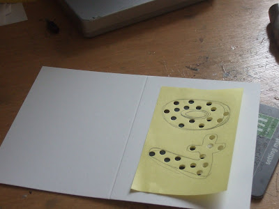
1) draw the outline of your numbers (or letters, or even shape e.g. heart) onto a post it note. Doing it this way means that you don't have any pencil lines to rub away at the end and you can redraw as many yimes as you like (drawing is NOT my strength. If you really can't draw you could always print letters out from your computer.

2) postion on card (landscape or portrait, it doesn't matter)

3) take your LARGEST punch and randomly punch within the shape. Make sure that some go right up to the edge. Fill the shapes.

4) with your MIDDLE size punch fill in the gaps between the larger holes, again make sure that some go right up to the edge.

5) now do the same with the SMALLEST punch. (always go from large to small as it's about filling gaps).

6) remove the post-it note and check it looks okay. add more holes if required.

7) add an insert, to complete the card.

Here's another example of the same technique with some extra embellishment.


i am entering the star card for the less is more 1000 challenge

Sunday, September 18, 2011

reversible Cath Kidston style tote


I found these gorgeous fabrics at Leeds Market, for £4 a metre. They are just gorgeous and I love the contrast the two fabrics.

I have used the "tea towel tote" method to make this bag, which makes it totally reversible.

so the decision is... which way to use it

Saturday, September 17, 2011

less is more and OLW 64


This week at the less is more challenge they are trying to go for 1000 entries! but luckily the theme is anything goes, so any clean and simple entries are eligible to enter..

meanwhile at One Layer Wednesdays the theme is colour it. I have been fiddling around with a bit of a new colouring technique this week, instead of putting a nice smooth surface under my card and colouring in a detail manner with light strokes, I have put a textured surface (denim) underneath and coloured with firm, bold strokes and not worrying about outlines. I love the result and it will make batch cards a breeze. This card uses Jo Capper-Sandon's new starbird with chick stamp from Stampotique, which I have coloured to look like a robin, with a simple christmas greeting which I found in my freebie box.